A month ago, I flew from London to NYC, paid $3500 for a Vision Pro headset at Apple Fifth Avenue, and flew back home. I’ve been using it every day since — here’s what I think.
My background, for context:
- I’ve been working in AR for many years.
- I built the largest open-source projects for both of Apple’s AR frameworks — ARKit and RealityKit.
- I pioneered AR Navigation, which you can try out in Apple and Google Maps.
- I run an AR startup called Hyper, where we’ve built breakthrough AR technology for precise indoor location.
- I’m not knowledgeable on AR/VR hardware.
- I own a PSVR, Oculus Go, Quest 1 and 2 — and now, a Vision Pro.
I’m going to assume some familiarity with Vision Pro and focus on a few key areas. I’d recommend Wired or The Verge reviews for an introduction.
I typically use Vision Pro for working via the Mac Virtual Screen feature, and watching TV/movies.
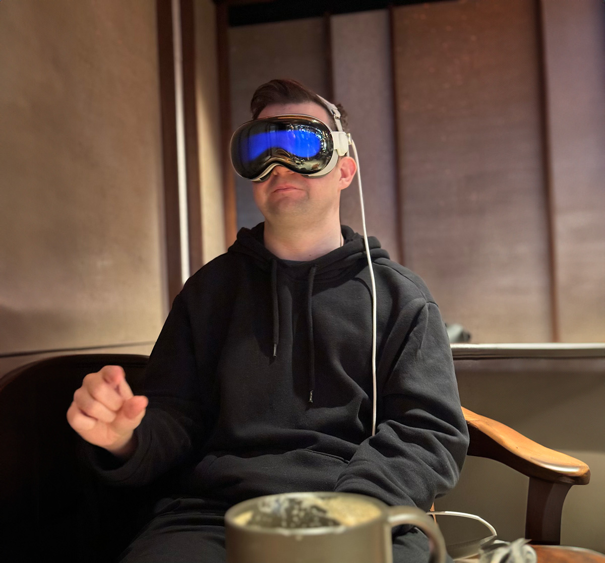
Passthrough
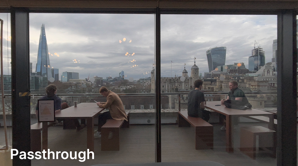
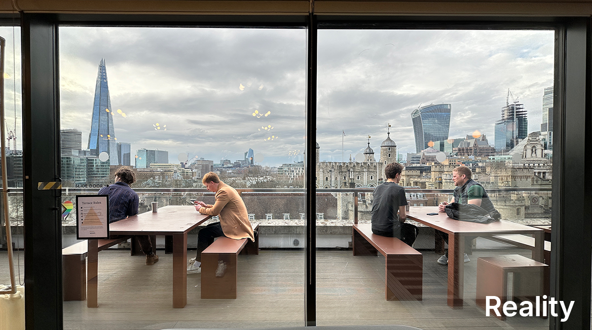
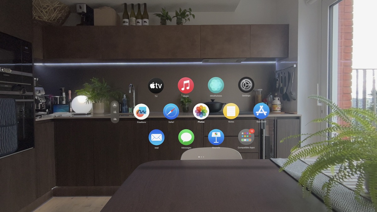
Passthrough is impressive compared to everything else I’ve tried, but still feels like viewing the world through a noisy camera feed. I was surprised — many of the initial impressions from last year described it as life-like, almost impossible to tell from reality.
The pass-through video experience is so seamless, so natural, so much like just looking through glasses, not looking at a screen inside a headset
It’s not, and this is misleading. Here’s an example of passthrough compared to real life:
- Passthrough quality will be a year-on-year improvement, it’s not quite there yet.
- Apple have done a remarkable job of minimising distortion, compared to Meta who have been shipping passthrough for about 4 years but still have challenges.
- Some typical camera behaviours remain — flickering lights, lens flare, exposure issues, motion blur.
Immersion
- The screen resolution is stunning. The rendered virtual content looks real, you can’t see any pixels. Ironically, the virtual content looks closer to real life than the passthrough camera feed.
Environments
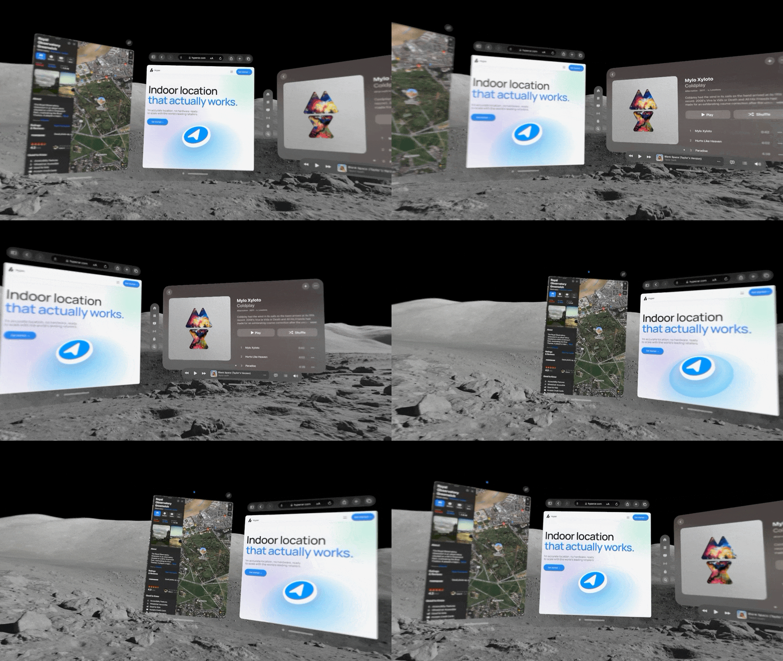
- Environments are impressive, but could be more interesting. Quest has you in cozy home environments with a warm fire, or on a space station with an immersive window.
- There are some more fun environments, but they’re hidden away in different places. Keynote has a boardroom, and Steve Jobs Theatre. Disney+ has New York City and Tatooine. Apple TV app has a cinema environment, plus it can blast the video out to a giant cinema screen over your system environment.
- Will Apple open up environments in some way? I’d pay $$ for an environment pack.
- The environments are also a bit fiddly to change right now.
Comfort
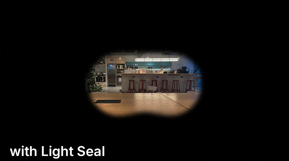
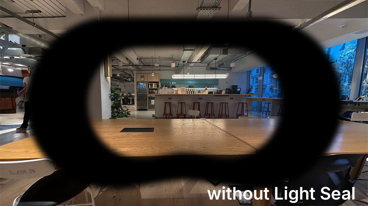
- A number of factors make Vision Pro less comfortable to use: limited field-of-view (tunnel vision), passthrough quality, motion blur and weight. When I take it off, I feel some relief to be back in the real world.
- But using without the Light Seal is a massive improvement. You’re closer to the screen, so it reduces the tunnel vision and expands the effective field-of-view. And rather than a black edge, you have a frame, with outside visibility.
Of course, it’s not designed for this — the aluminium frame is just resting right on your nose. I really want someone to make an accessory to solve this.
Inputs
Look-and-tap feels very natural and quick to pick up. It’s Apple’s next interaction model.
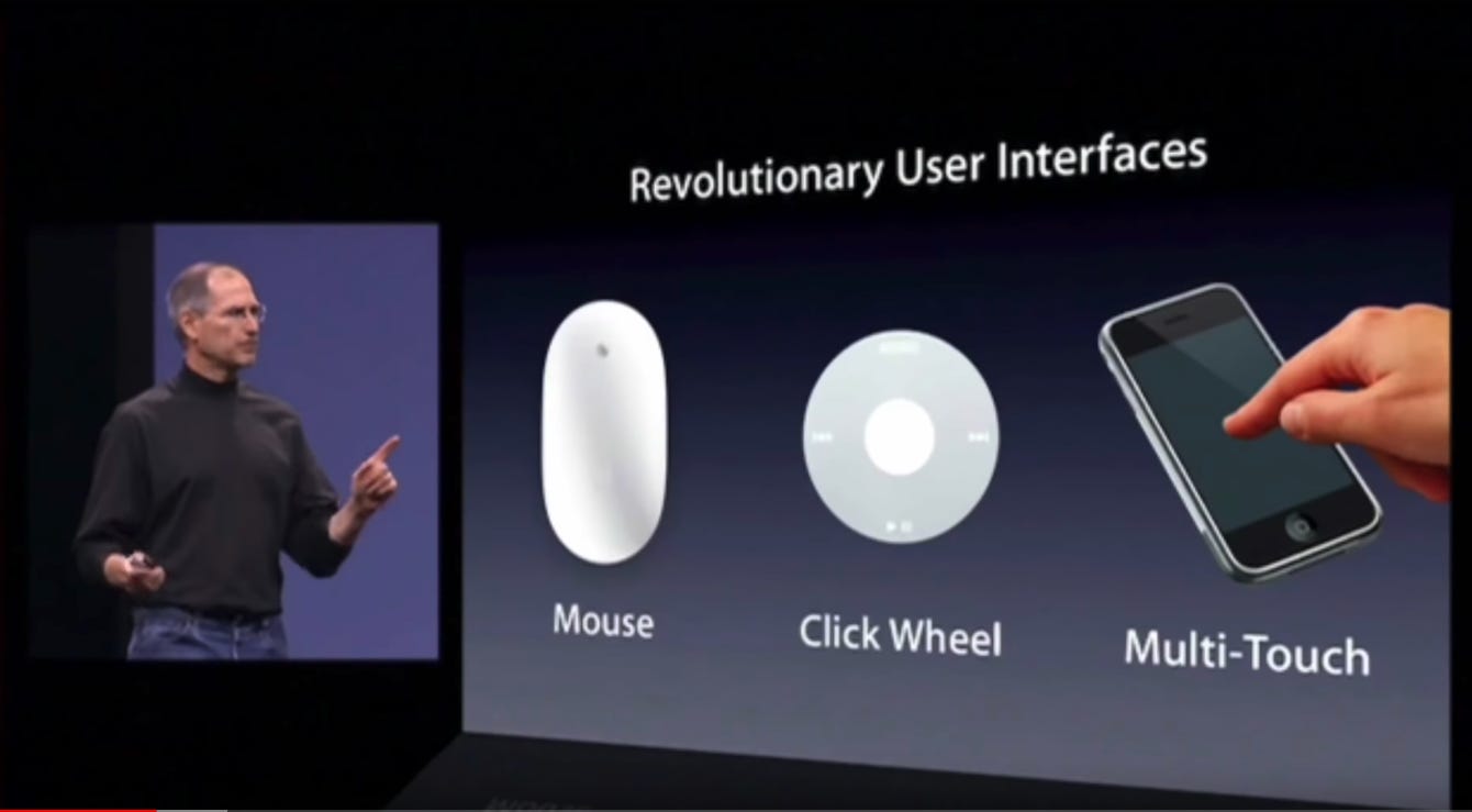
But it’s not perfect.
- After using it for any length of time, I realised that my eyes move onto the next thing before I’ve tapped. Moving my eyes over to every button and staring at it until I’ve completed a tap, feels like a chore that’s slowing me down.
- There’s also anxiety because everything you look at is immediately selected, and one accidental tap could be destructive.
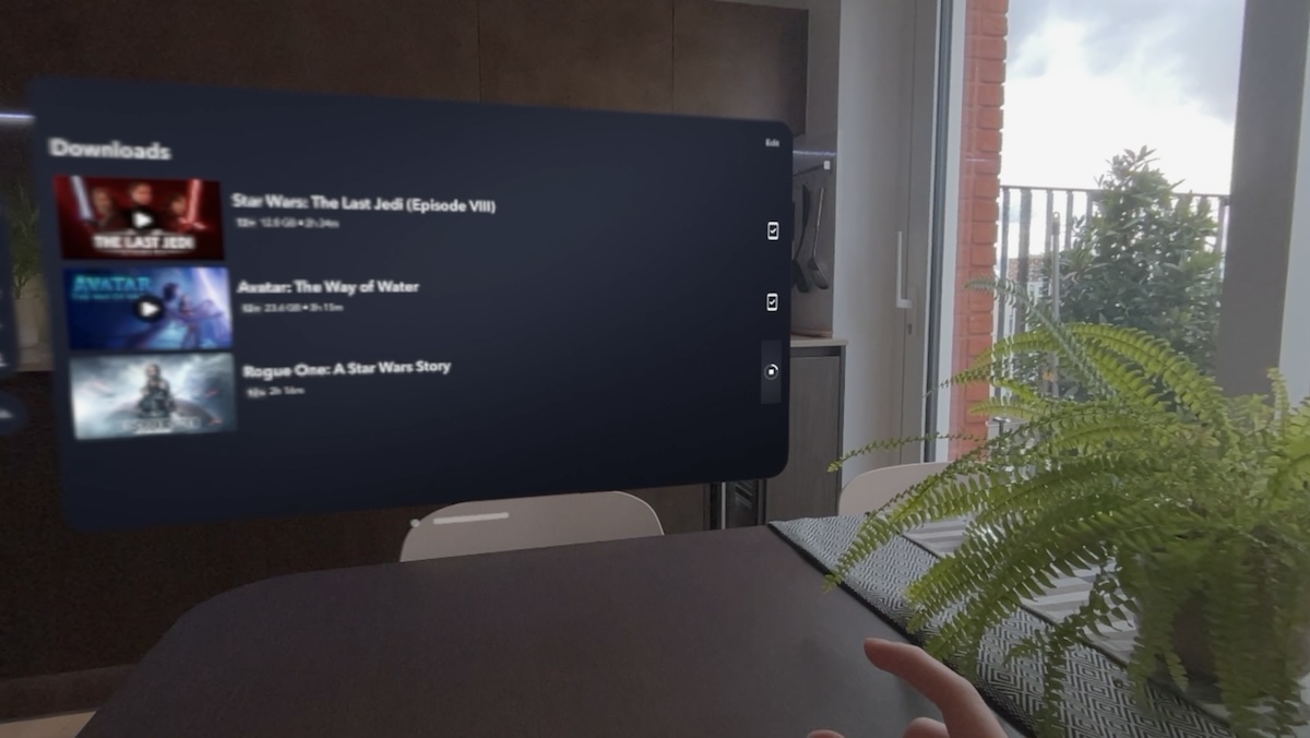
- I was downloading Star Wars for my flight back to London. The only way to check progress over slow hotel wifi was to look at the progress circle, which is also the cancel button. I was aware that every time I checked progress, I was one finger-spasm away from cancelling the whole download.
- Virtual keyboard is very challenging for air-typing on. It turns out you really need a surface to rest your hands, and physical feedback when you tap.
- When you think about it, even iPhone keyboard has the feedback of touching a physical surface as you tap each key.
- You can also peck at each individual key by looking and tapping — this is as cumbersome as it sounds.
- The most practical solution is to use a physical keyboard, via Mac Virtual Screen or connecting one directly, but this is a bandaid solution. It reminds me of the keyboard solution for iPad 1. Hopefully Apple have a much better answer to this for v2.
visionOS
The biggest innovation with Vision Pro is visionOS. visionOS provides native app frameworks, so developers can build apps for it. That sounds ridiculously obvious, and yet its something Meta have failed to offer for years.
Every app on Quest has to reinvent how buttons work, how a scroll view works, how far away from the user the content should be etc.. and every app works differently. On visionOS, all of this is handled by Apple, and every app looks and feels the same.
The apps can also co-exist alongside each other, in your own space. Quest and PSVR are consoles, by comparison. You tap a title, it launches a fully immersive Unity app with a custom UX. You click a home button, back to your list of titles.
On visionOS, apps can’t freeze up the system — if there is a crash, passthrough and environments will always keep rendering without missing a frame, so you never feel nauseous from that. It doesn’t flash white in your face when you launch a new app, like often happens on Quest. Small details that matter.
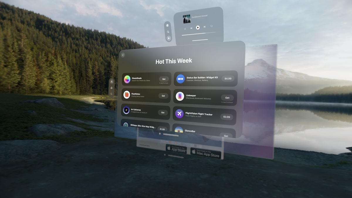
But it’s still early days for visionOS. It really feels like a perfect v1 OS, with the foundations set and tonnes of opportunity for improvement. Window management in particular needs a lot of work:
- Windows by default all just open in front of you, which quickly turns into a stack, that you have to manually move each window out the window to get to the ones behind it.
- If I want to keep some of my apps open but out sight, I just drag them off to my left and leave them over there to pile up. It gets messy.
- There’s no way to ‘hide’ or ‘minimise’ an app. If I tap close on Disney+, my download continues in the background. If I tap close on Apple Music, my music stops playing. 🫠 So this needs some work.
Content
- There was a rumour last year that Apple was shooting all Apple TV+ shows using special cameras, for immersion in Vision Pro. Sadly not. For All Mankind isn’t even available in 3D.
-
The only immersive content currently available so far is a handful of short one-off videos. They are all incredible, much higher res I’ve seen in any immersive video – but you can get through everything in less than an hour.
-
Spatial photos/videos are also an amazing experience, even just watching the videos from a month ago give me a blast of nostalgia.
-
There aren’t that many apps available yet, it’s a lot like the early iPhone days in that sense.
- The first-run experiences on PSVR and Quest give a great intro to the system. Vision Pro is just the necessary boring setup steps. I was hoping for something more exciting, similar to the experience I had when I bought my first Mac.
Sharing and giving demos
Every device is calibrated to the owner, with a custom Light Seal etc.. so one of the first questions I had is, can I demo and share this with other people? Yes, but it’s early days and these features need some work.
Sharing screenshots
- Vision Pro renders high-res visuals where you look, and blurs everywhere else to boost the frame rate. This is all fine, but when you take a screenshot, it includes the blur, so people who haven’t used it before are confused and think it really is that low res (check my screenshot above demonstrating the cancel button for an example). Apple should make it render the full frame for screenshots.
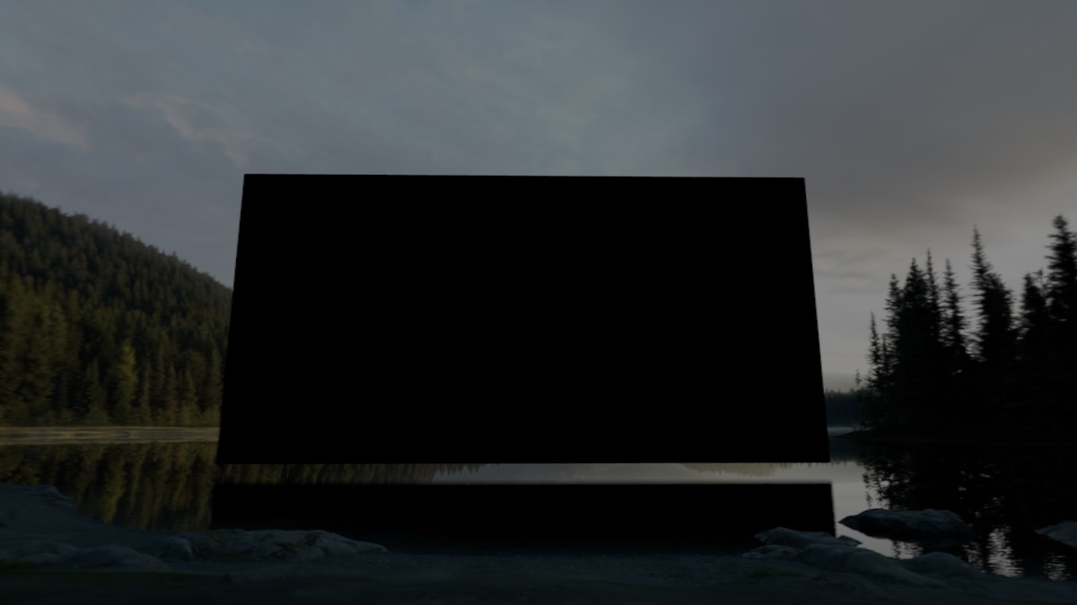
- Watching Apple TV+ shows on a giant screen reflecting in the ripples of the water under Mount Hood, is stunning. I live in the phones-at-concerts generation, so my immediate reaction is to screenshot and share how amazing it looks. But for copyright reasons, if you try and screenshot most content, it blacks it out, which is a shame. I always forget, so I have tonnes of screenshots like this.
Guest Mode
- Apple provides two options for guest mode - full access, or just the currently open apps.
- Full access means full access, including your photos, email, notes etc. 💀
- Limited access means you have to set everything up perfectly each time, and if they accidentally close out of something, they’re doomed. But surely, they can easily reset Guest Mode, right? Eh, no.
- If your guest lifts the headset off their head, they’re kicked out of guest mode, and have to hand it back to you. They have to go through the 2 minute setup process every time. A few tweaks and this whole system could be a lot better (“remember me for later”?)
- And to be honest, I also don’t mind my guest having access to 90% of the system, just protect some of my apps and we’re good.
- One great feature of demo mode is Mac mirroring, which projects the view from the headset onto your Mac. This is great for quickly giving demos to a small group. The caveat: they now can’t try out watching TV shows and see the Mount Hood ripple effect. Or any of the immersive videos, which would otherwise make for a great demo. It blacks out the video, both on the Mac mirroring and inside the headset. The guest will be staring at black for a while, thinking it’s just atmospheric. So my tip right now is: always go for the trailers, they’re not copyright protected and still help to demo the TV/movies features.
Conclusion
I love a v1 product. v1 should demonstrate some value and a vision, but still be a little rough, with plenty of things people can point at and criticise (such as some upstart tech person with a new blog, for example 👀).
Vision Pro is a perfect v1. There are some things to improve, and some hardware teething problems too (my right speaker is overheating). I’m using it 1-2 hours every day, and my feedback is all in the direction of “if x were better, I’d find it even more valuable”, which is a positive signal. I’m super excited to see what comes next.
